Wednesday, May 6, 2009

Resume


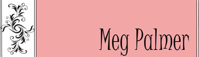
This is the resume that was made with InDesign in Spring 2009. There were plenty of trouble with this concept. First it was hard to get out of the idea of stark, plain resumes and put some color into mine. I had trouble being creative without going overboard and keeping with my own style. Next there was the problem with exporting it. I was unable to export as a PDF so I had to upload it as a JPEG. I feel all in all it came out better than I hoped and I feel my statements are strong enough to catch the attention of most design firms.


Process Poster

The Process Poster was done with InDesign. This was after the resume. I feel I had overcome a lot since the resume and it shows in this poster. I chose to stick with more of Andy Warhol's ideals for the colors and the style of the poster. There are groups of four and it is very geometric. I think the added white boxes behind the writing made it very easy to read. I also like the way the pictures and sketching turned out. The only thing I feel looks oddly placed would be the first picture of the beauty bark. It has a black background while all of the other sketches have white backgrounds.

Thursday, April 30, 2009

Weekly Sketches

Sketches from Interior Design 197


Sketches from Interior Design 102


These are the sketches from ID102 and ID197. These were required as a weekly deal. I feel that even though they were quick twenty minute sketches they helped enhance my drawing skills. This also pushed me to take a look at things differently. I now feel the urge to sketch beauty that I see as I am walking throughout the campus or town.

Quilt Pattern


The quilt pattern was a way to get more involved in Photoshop. The first part of the project was to take photos that would later be changed in the program. I took pictures of the Washington State University campus. My images include trees, the sky, buildings, artworks, and cars. Through Photoshop, I changed the sky to appear as water, both a tree and wall of a building to look like fabric, and rocks to have the appearance of a watercolor painting. This was a great way to learn how to use the filters in Photoshop. This project could have been improved by different things. I should have checked for blank spaces found in between the placed images, checked the alignment, and even altered the colors to follow a certain scheme.

Textile Design

The textile pattern was a project that was inspired by the cultures of each person creating them. This was an interesting way to get to know my background history, Adobe Photoshop and Adobe InDesign. To get to the final point I had to go through many trials and errors. The first pattern I had created involved an image of a cheetah, the Virgin Mary, and skulls. I felt that this was not going to be easily recognizable as part of the Mexican culture. Also when brought together the images were not aesthetically pleasing. So, after starting from scratch, I came across tiles found in the kitchens of Mexico. I used Photoshop to alter a tile and added my own flare of skulls and a cross in the center. I made the skulls nearly transparent and changed the color of the cross. I feel I was able to get a better grasp on the technology part of designing through this project.

Logo


The logo was an assignment that could be put onto other assignments. Our own little signature to show ownership and craftsmanship. This was a fun way to express ourselfs. My first color choice was a dark lavendar. It was paired with black font and a white background. After trying this out for awhile I realized that it may be hard to read for some. I then tried out a few colors like pink and yellow. The color that really stuck was the pale olive green. It is seen on the business card.


Business Card


The business card was probably my favorite assignment. This was done in both Adobe Photoshop and InDesign. I used my logo in the bottom right for the main focal point and some artful flowers I found on the internet. The back of the business card carries the same green stipe and brings your attention to the contact information I posted about myself. I used a pink color to tie the whole business card together. This same pink is used for my header of this blog.